
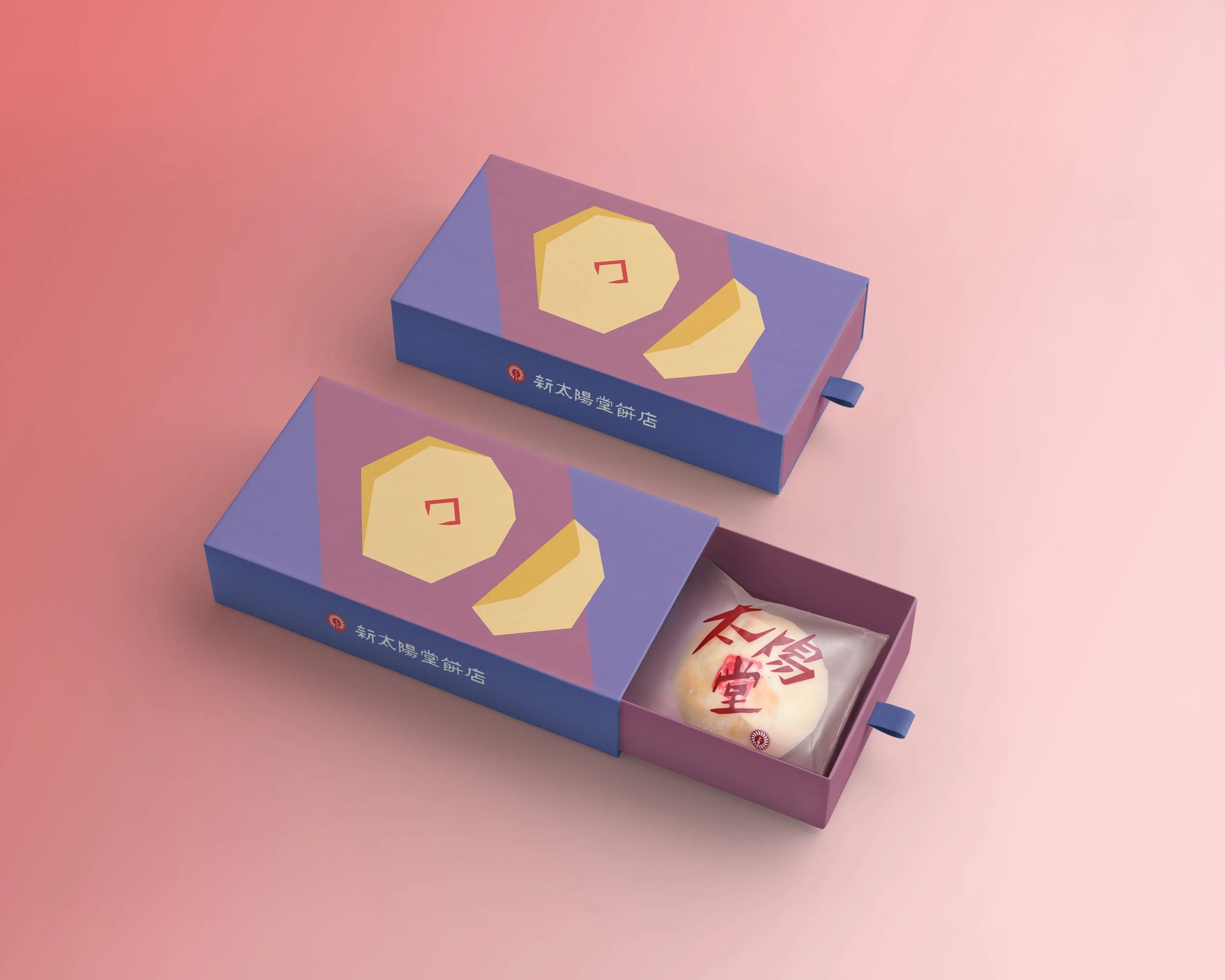
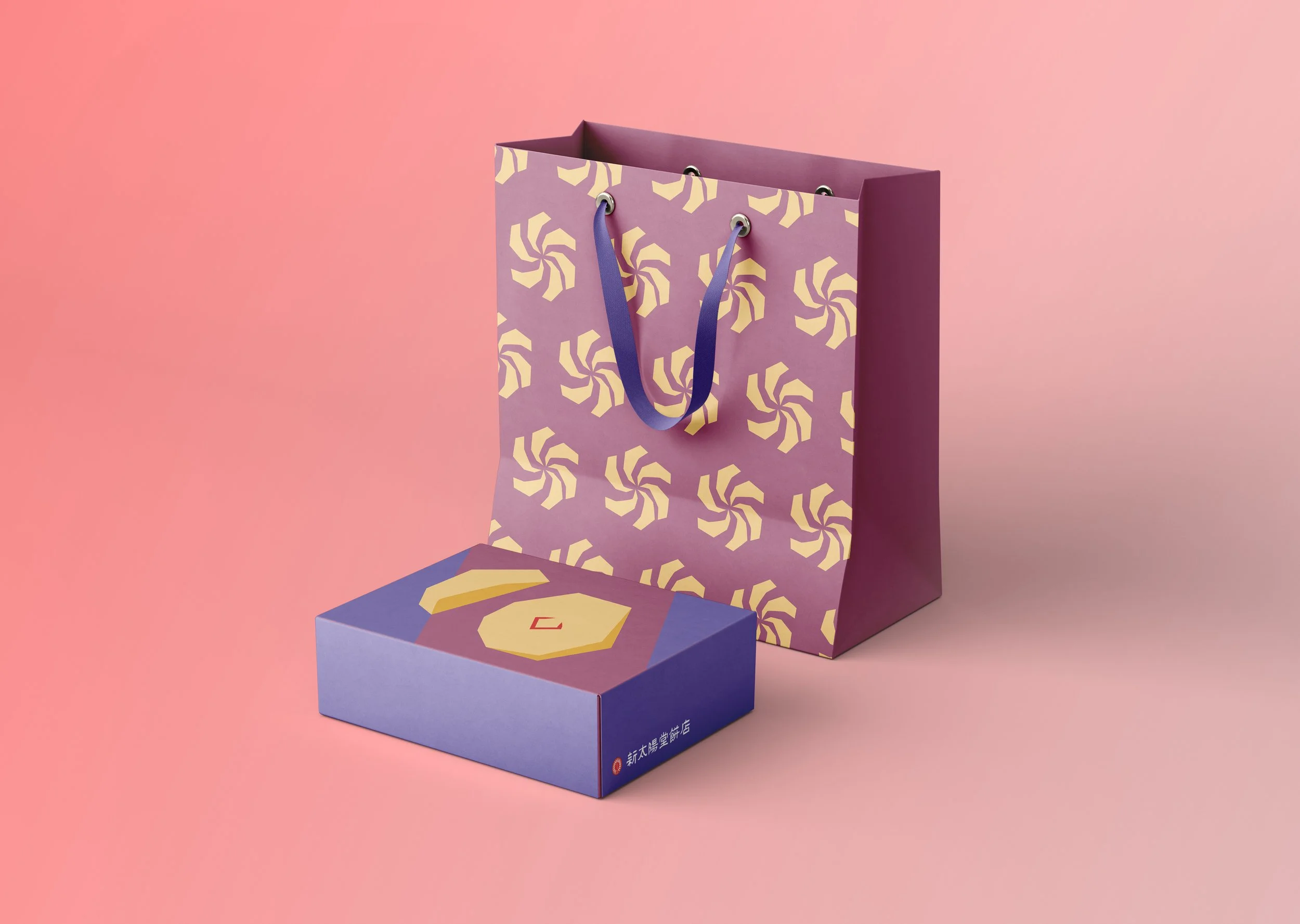
Sun Cake Package Design
This project was commissioned by “Tai Yang Tang,” a renowned sun cake brand in Taichung, to redesign its packaging.
The brand logo, originally designed by the founder’s grandfather, the influential Taiwanese artist Wang Shui-He, serves as the foundation of the visual system. By repeating and transforming the geometric elements of the logo, the design develops sun cake and sunflower motifs, creating a distinctive visual identity.
The original color palette is retained to convey an elegant and refined brand image.
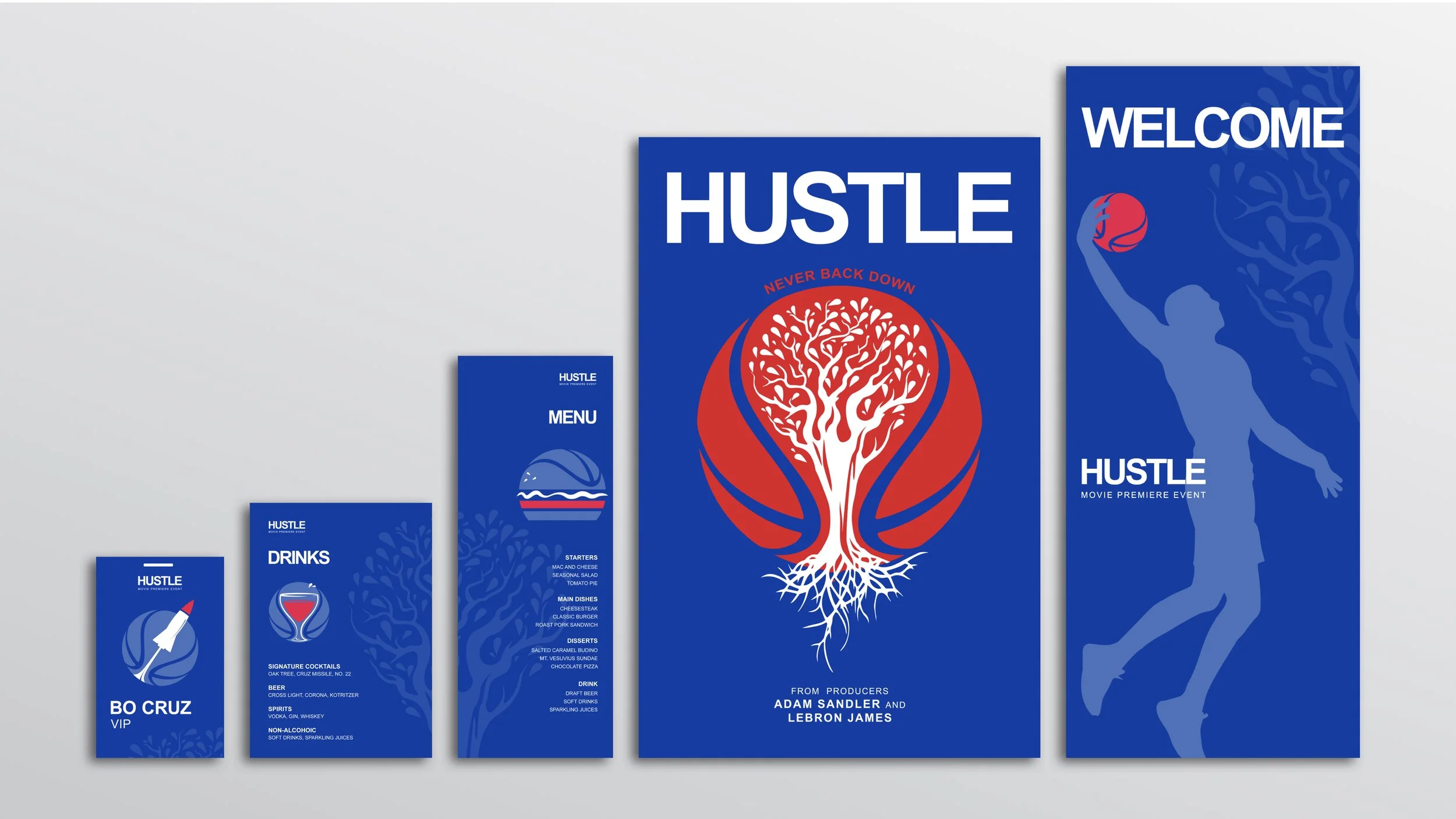
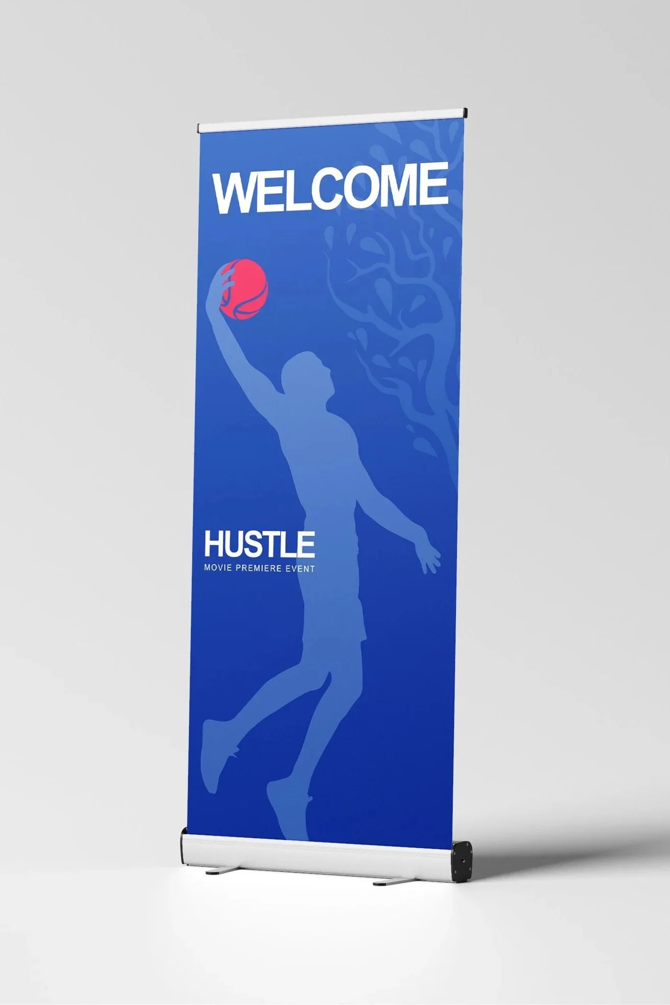
Film premiere collateral
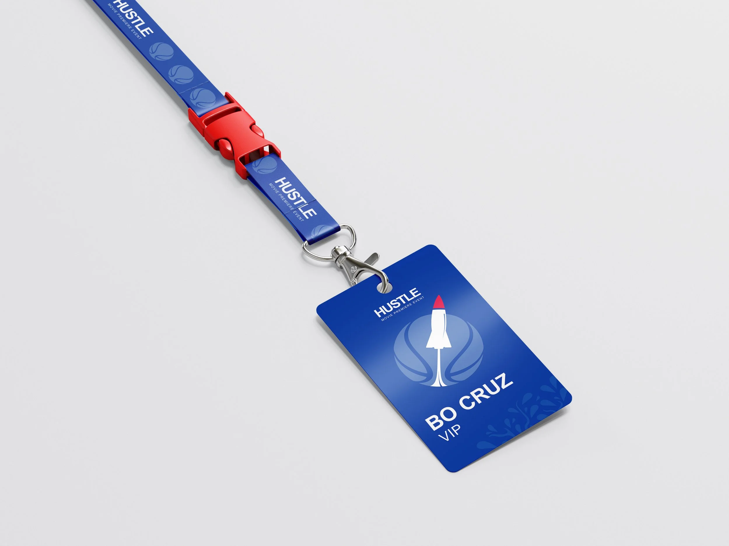
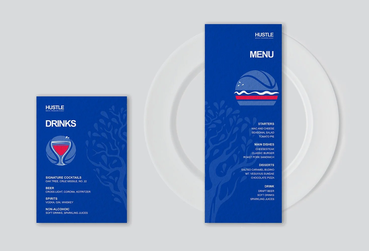
This internship project at Sparks explores the development of a visual identity and collateral system for a fictional film premiere inspired by Hustle.
The concept draws from both the film’s narrative and my personal connection to Philadelphia, reflecting themes of growth, mentorship, and adaptation in unfamiliar environments.
The color palette is inspired by the Philadelphia 76ers, using red, blue, and white to anchor the design in its local context.
The key visual merges the protagonist’s oak tree tattoo with a basketball, translating symbolic elements into a cohesive graphic language.
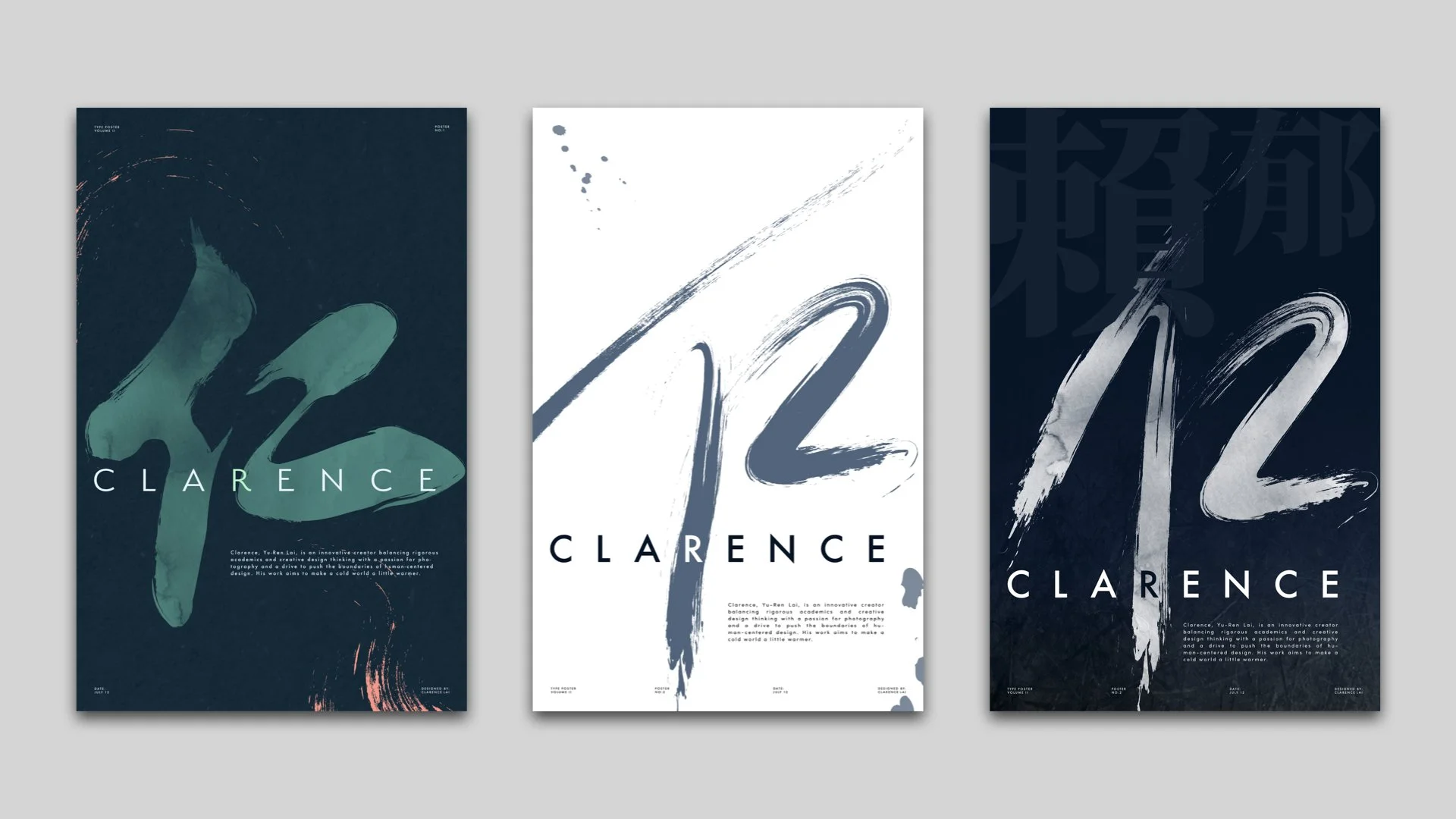
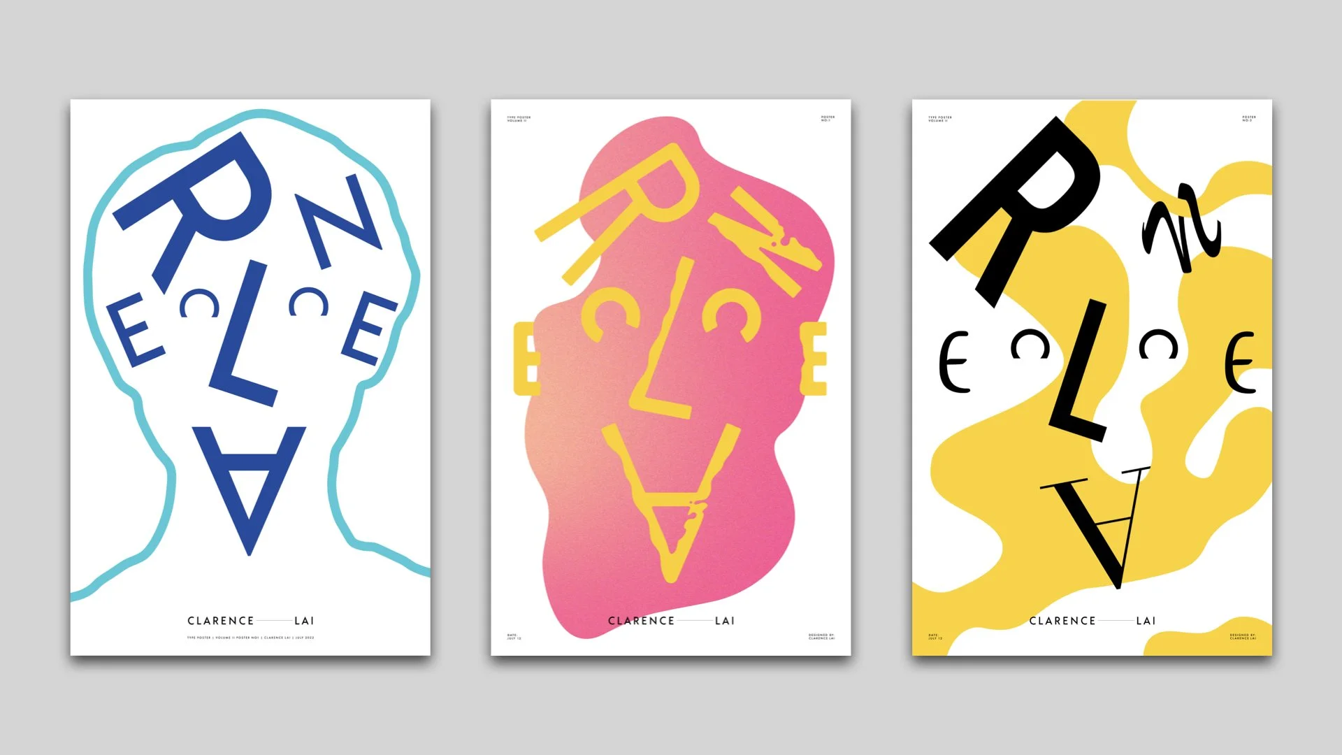
Type Poster
Using my personal profile as content, I created a series of typographic posters.
The first merges the Chinese character Ren (仁) with the letter “R,” exploring how form and meaning translate across cultures.
The second transforms the name “Clarence” into a typographic self-portrait.
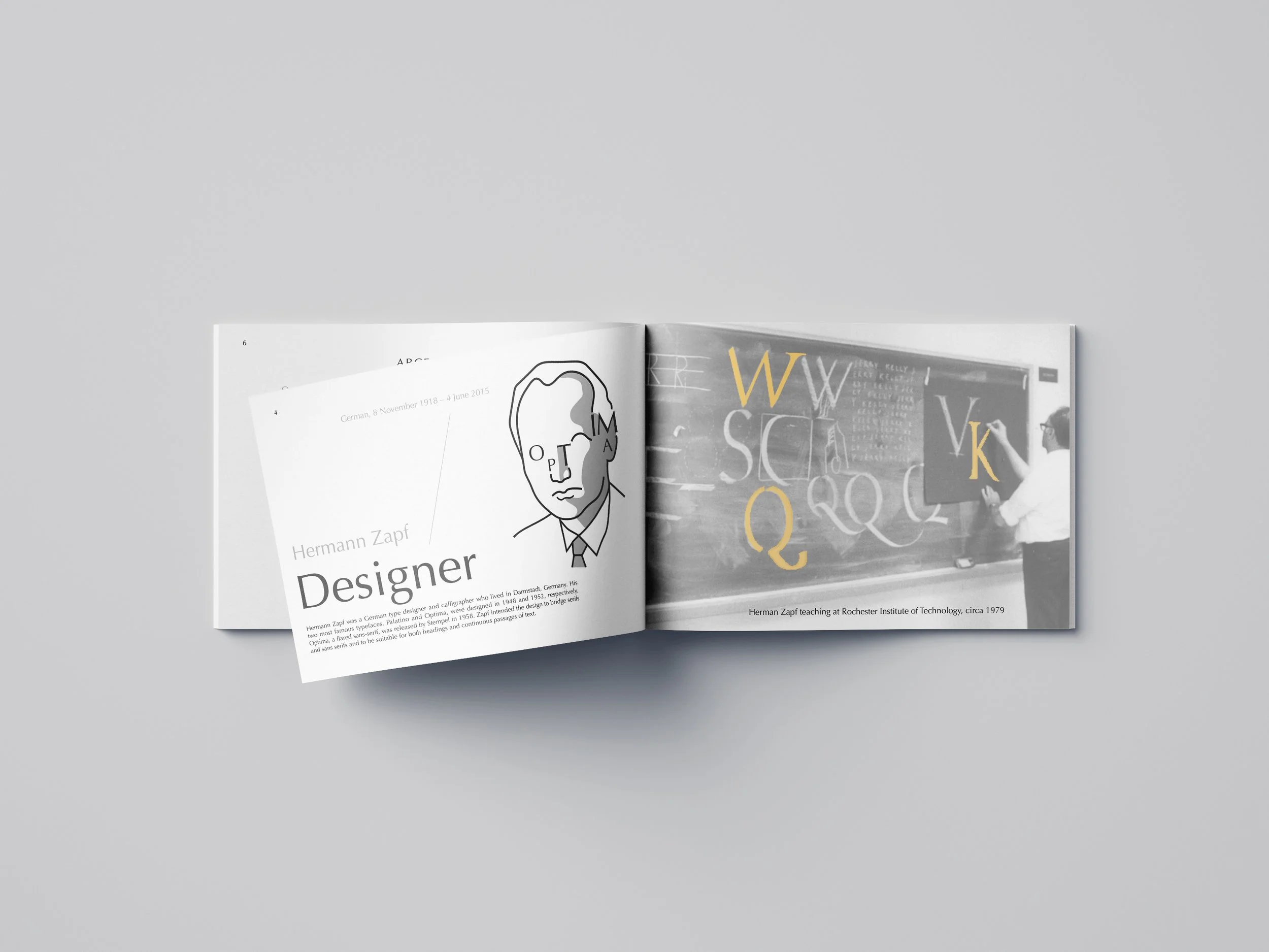
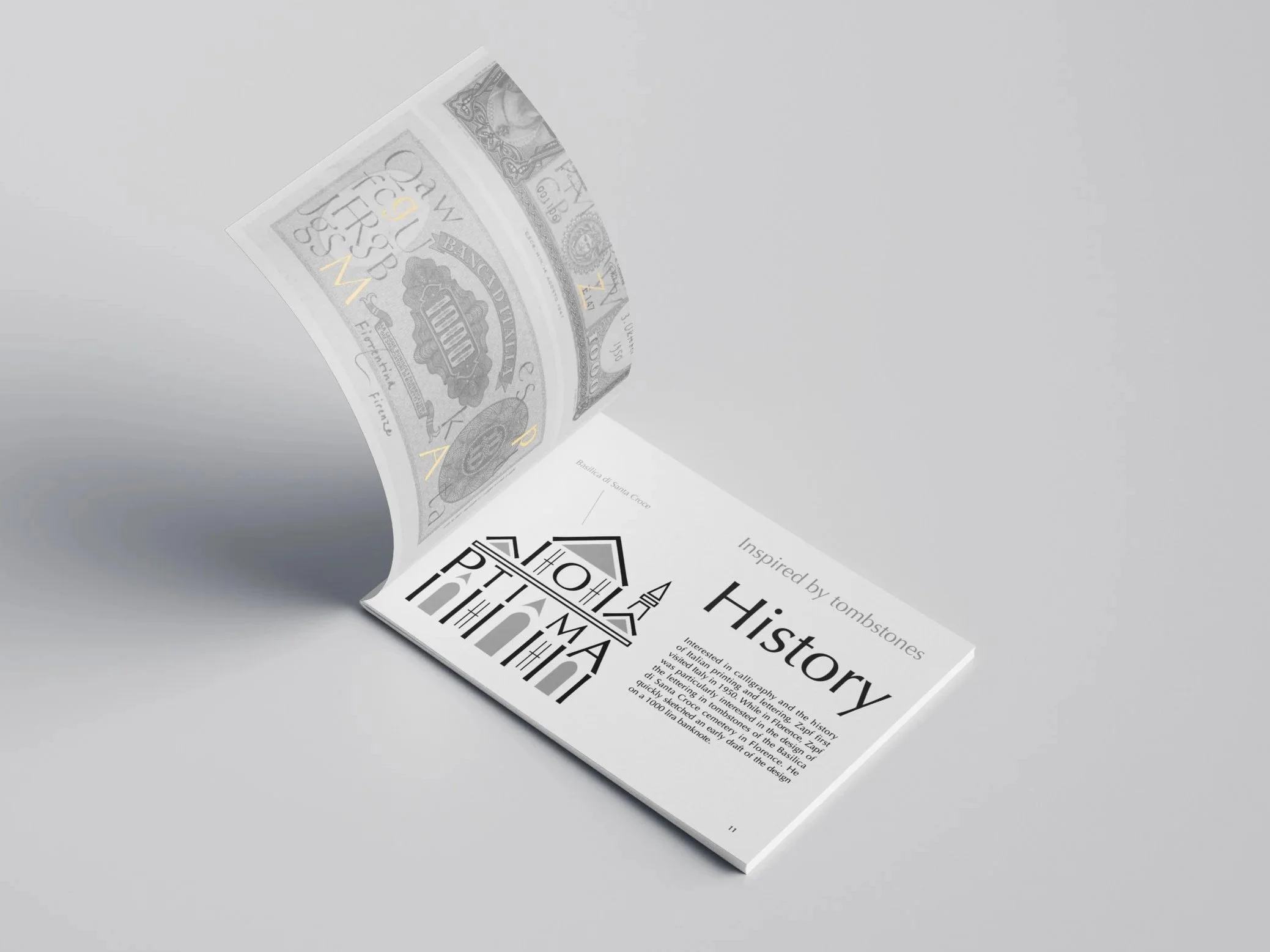
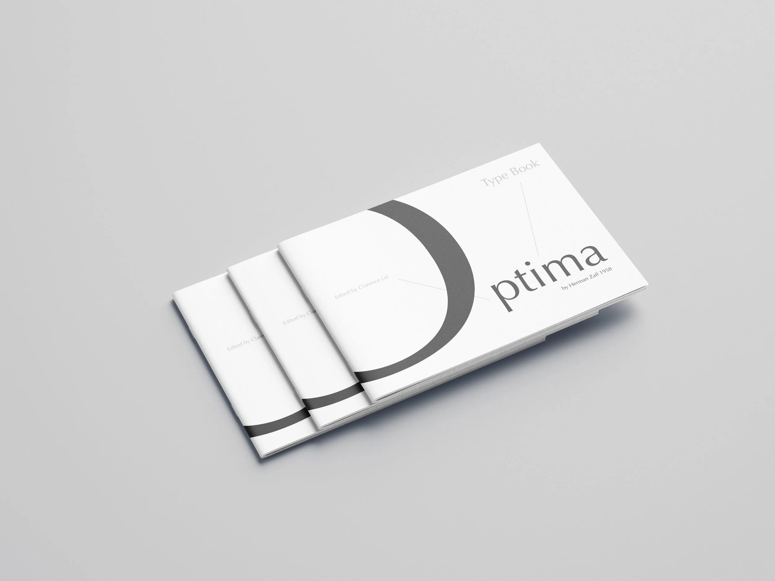
Optima Type book
In this project, I developed a type specimen book to explore the history and application of a typeface.
Focusing on Optima, I reconstructed its letterforms into an illustration referencing its designer and place of origin, using visual storytelling to introduce the typeface.
The project emphasizes clarity, structure, and readability through typographic layout.
Next